PROJECT CORRECTIONS/TIME SPENT
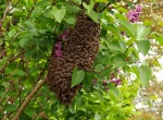
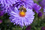
I spent 3 hours making corrections to my montage, infographic and business identity projects. I mainly worked on my color schemes for the infogrpahic and business identity. For my montage I deleted 2 of the images and prepared another in photoshop to use in their place. I am much happier with my new products, although I can already see changes that I would make now!
DESCRIPTION
Design a portfolio that showcases all projects from my Visual Media course.
PROCESS (Programs, Tools, Skills, FOCUS principles)
1. I made corrections to various projects.
2. I viewed other portfolios on Pinterest and google to get ideas.
3. I used InDesign to create my multi-page layout.
4. I used Photoshop to help create my design for my layout and applied it to the pages.
5. I created master pages of the text boxes so that they would be in the same position on each project page.
6. I applied each project in order of what I felt my best work was based on grade and feedback received in the class.
CRITIQUE PROCESS
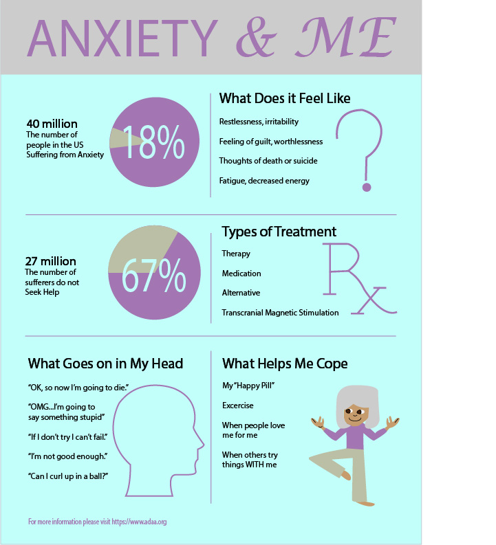
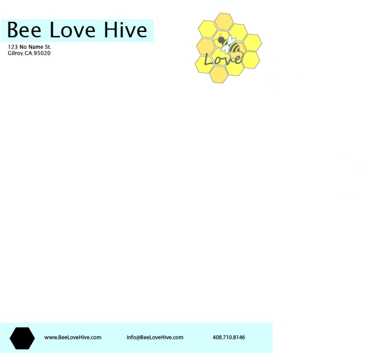
Kevin and Anne both had suggestions regarding my color scheme. Kevin noted how if I print a lot of black then I will probably have streaks unless it is a very experienced printer. Anne brought up how while a black, yellow and purple color scheme matched a good portion of my projects, it didn’t match them all and could detract from those. My husband helped me finalize my final layout that I went with after changing my colors and design as a whole. I am able to tell when he just “likes” something and when he is impressed, so I keep going until I get that impressed face.
Facebook Critiques: Kevin Caroll, Anne Law
One-on-One Critique: Katrina Deely
Instructor Critique: My instructor told me to pay attention to my color scheme and to add more excitement to my design.
MESSAGE
I want to showcase my work in a professional way.
AUDIENCE
Potential client and employers.
TOP THING LEARNED
Simplicity is OK.
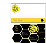
COLOR SCHEME & COLOR NAMES
Monochromatic // Black and White
TITLE FONT NAME & CATEGORY
Pristina // Serif // Script
COPY FONT NAME & CATEGORY
Calibri // Sans Serif // Classic
THUMBNAILS OF ANY ORIGINAL, UNEDITED IMAGE(S) USED IN THE PROJECT
N/A
SOURCE OF EACH IMAGE (website name and hyperlink)
Images and graphics are my own.