DESCRIPTION
Design a spiritual poster montage using the blend of images and type.
PROCESS (Programs, Tools, Skills, FOCUS principles)
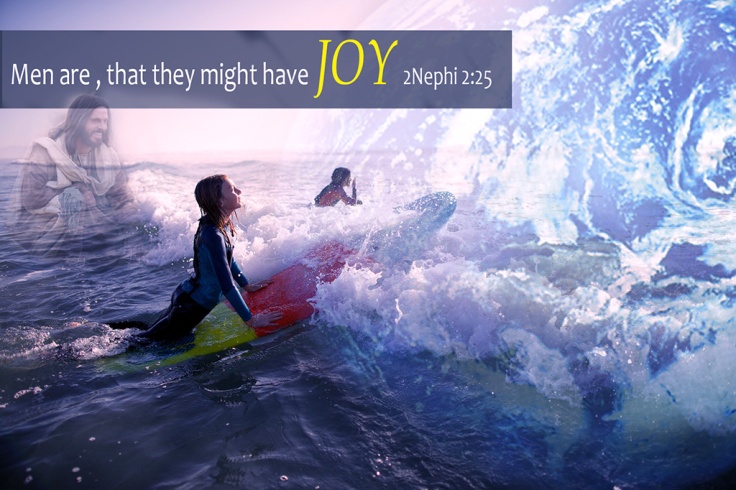
I tried to think of what made me feel closest to Christ. I am in awe of our beautiful Earth, and one of my favorite places is the beach. The waves and sounds there make me feel Christ’s love every time.
1. In Photoshop I was able to cut, size, and combine all of the photos. By using the brush tool I created the montage effect.
2. I searched for a scripture that I liked. Since Christ is laughing I wanted to tell how we are meant to have joy, and how happy I imagine that makes him when we do.
3. After lots of moving around, I feel I was able to apply the FOCUS principles. There was not a lot to align but I made sure that it didn’t look cluttered and that it flowed. I adjusted the colors to give it a more unified look.
CRITIQUE PROCESS
I received a lot of great feedback from Facebook. Anne Law was especially helpful. I always admire her text placement and choices and so I sought her help and she came through big time. It was also suggested that I enlarge my Earth image and I love the results from doing that. Missy suggested that I give my colors a more uniform look and recommended that I use an overall contrast filter. I feel I got more out of this critique process than I have in the past, probably because I was able to get things together more on my end. Critiquing others work helped me a lot. I was able to get ideas on what to do with my own image as I was looking at theirs. They were all so inspiring!
Facebook Critiques: Missy Hollan, Anne Law, Christine Windward, Lindsay Handley, Kevin Carroll, Caroline Webster, Kylee Priest, McKenzie Farnsworth
One-on-One Critique: Russ Wharton
Instructor Critique: Goodbye Papyrus…I promise to never, ever, use it again! I knew the font didn’t work but I was so lost on what to use. Of course it was caught so away it went. I used some that Anne suggested and found something that fit. I also got rid of the orphan JOY text that I had by moving everything to one line. I was hesitant to use a text box but I couldn’t make my text stand out to where I was happy, I’m hoping I did OK there since it wasn’t on my original image. I am so glad I enlarged the Earth, made a huge difference.
MESSAGE
The Earth was created for us, we were put here to experience joy, and when we do it brings Jesus Christ and Heavenly Father joy.
AUDIENCE
Those looking for why there are here.
TOP THING LEARNED
NO PAPYRUS!
COLOR SCHEME & COLOR NAMES
Complementary // Blue and Yellow
MAIN TEXT
Candara// Sans-Serif
JOY TEXT
Book Antiqua // Serif
THUMBNAILS OF ANY ORIGINAL, UNEDITED IMAGE(S) USED IN THE PROJECT


SOURCE OF EACH IMAGE (website name and hyperlink)
Sample work of Lisa Wharton, to continue exploring her work click here

October 20, 2016 at 2:29 pm
Lisa, this picture turned out so awesome! I like the changes you made to the world and the image of the Savior. I would hang this up in my home. Such an inspiring message. Great work!
LikeLike
October 22, 2016 at 5:12 am
I like how yours turned out! It is cleaner and simpler than how it was before. Great color scheme too.
LikeLike